Skip to main content Skip to footer


Learning Centre

Data List

The Data List component allows you to display stylized price lists, hours of operation and other data sets on a web page. Learn how to add a data list to a content page and explore the different setting options.

Add a data list

To add a data list component to a content page, you need to:

  1. Navigate to the page you'd like to add the data list to
  2. Select the 'Add content' button under the 'Main content' area of the page's 'Content' tab
  3. This will open the 'Add content' slide-out panel
  4. From here, select the 'Data List' component
  5. This will open the 'Data List' slide-out panel
  6. Select the 'Add Data List Item' button to add content to the data list
  7. This will open the 'Content' slide-out panel for the data list item. Here you will enter the details for the data list item
  8. Repeat steps 6 and 7 for each new item you'd like to add to the data set
  9. Select the 'Create' button to complete the process

Complete the data list details

From the 'Data List' slide-out panel, you can fill out the details to customize the content and format of your data list.

In the 'Heading' field of the 'Data List' slide-out panel, you can enter the title for your data list. For example, "Hours of Operation" or "Recreation Pass Fees."

Underneath the text field, you can choose the size of the heading text:

  • S - small
  • M - medium
  • L - large

In the 'Subheading' field, you can enter a subheading if you'd like. 

Select the 'Add Data List Item' button to add an item to your data list. This will open the 'Content' slide-out panel for the data list item. Complete each of the desired fields.

Text left

The 'Text left' field is a required field for each data list item. This is where you will place the name of the item.

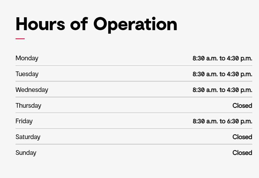
For example, if you are adding a data list to display the hours of operation, you might want to add the day of the week into the 'Text left' field. 

Additional info

In the 'Additional info' text box, you can add any additional information about the list item. This content will display below the content you added to the 'Text left' field. 

For example, if you are using a data list to display the hours of operation, you could add something about how staff will often be unavailable between 12 p.m. and 1 p.m. when taking a lunch break. 

Text right

In the 'Text right' field, you can add the data that you would like to display on the right of the data item. 

For example, if you were using the data list to display the hours of operation, this is where you would add the hours that the facility is open for that day of the week.
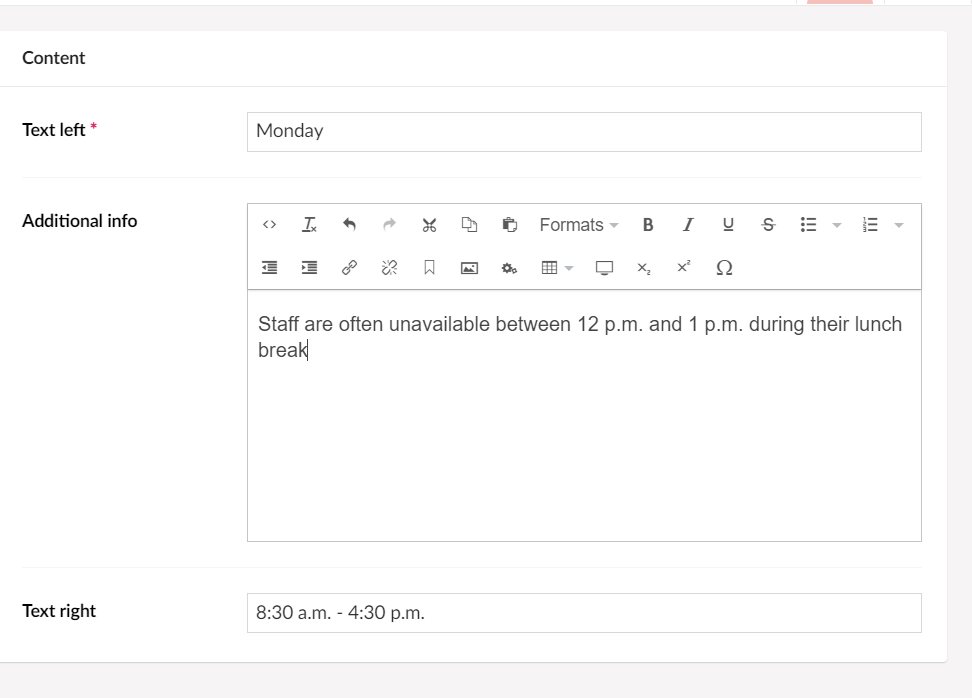
Data list settings

You can adjust the look and layout of the data list through the data list settings tab. To access the settings, select the 'Settings' tab located at the top of the 'Data List' slide-out panel.

Review each of the data list component settings.

Add a unique name for the data list in the 'Name' field. This will make it easier to identify this specific data list in the back office of Govstack, especially if you have more than one data list on a page.

For example, if you were using a data list for hours of operation, you could add "Recreation Hours of Operation" to the 'Name' field.

You can choose how many columns of data you'd like to display in each row. The following options are available:

  • 4 per row
  • 3 per row
  • 2 per row
  • 1 per row

Select the 'Submit' button to save your changes. Please note that depending on the data you'd like to display, choosing multiple columns can make a data list more difficult to read. We recommend using the '1 per row' option.

Turn on the 'Add container style' toggle if you'd like to add a box surrounding the data list. This can help differentiate the data list from other content on the page and adds a visual cue for the user.

You can customize the content colours of the data set using the colours that are part of your website design. Depending on your website design, you can add a coloured background behind the data list to create a hot spot on the page. 

Colour options

The colour options are based on the design of your website. You may be able to change the design colours depending on your Govstack plan. To get access to the website design features, speak with your GHD Digital Account Executive.

If you'd like, you can add an image to the background of a data list. To do this, you need to:

  1. Select the '+' icon next to the 'Background image' field
  2. This will open the 'Media' folder
  3. From here, choose the folder that contains the image you'd like to add
  4. Select the image you'd like to insert
  5. Press the "Select" button 

Please note

Adding an image behind text can cause colour contrast issues for users with low vision or colour blindness. You should only add an image behind text if it meets the colour contrast ratio requirements associated with accessibility legislation in your region. 

Background image options

You can also set a few options for a background image. Including the placement of the image, size of the image and whether or not the image repeats. We recommend testing out the different options until you find the one you like the best. 

This setting only applies if you are using a page with a 'Full' page layout. Typically full page layouts are reserved for the home page of your website or any landing pages you've created.

You can add animation to the data list by selecting the 'Animate' toggle. Once the 'Animate' toggle is selected, you'll have the option to customize the:

  • Animation style
  • Animation delay (seconds)
  • Animation duration (seconds)

Animation style

From the 'Animation style' dropdown menu, select the type of animation you'd like to add to the data list. There are a variety of different animation options in the following categories:

  • Attention Seekers
  • Bouncing Entrances
  • Fading Entrances
  • Flippers
  • Light Speed
  • Rotating Entrances
  • Sliding Entrances
  • Zoom Entrances
  • Specials

We recommend testing out a variety of animation styles to select the one you like the most. 

Please note

Animation styles can cause accessibility issues for some users visiting your website. For example, some users may experience motion sickness when viewing animated elements on your website.

Animation delay

Using the 'Animation delay' slider, select the time in seconds that you'd like to delay the animation. 

Animation duration

You can select how long you'd like the animation to last on the data list by using the 'Animation duration' slider. Select the number of seconds you'd like the animation to continue on the public website. 

You can create an anchor link that will link a user to this specific part of the content page. If you'd like to create an anchor link to the data list in the future, you can add a unique name in the 'Anchor name' field. 

In the 'Custom classes' field, you can add any custom CSS classes you may have. Custom CSS classes can be found in the Design node under the 'CSS' tab in the Govstack back office. 

If you'd like to add more than one custom class, you'll need to leave a space between each class. 

Please note

Depending on your Govstack plan, you may not be able to access the Design node in the back office. If you'd like to be able to add custom CSS and get access to the website design, contact your GHD Digital Account Executive. 

You can select additional styles for the data list, including:

  • Spacing
  • Visibility
  • Design

Spacing

You can remove the spacing around the data list by selecting one of the following options:

  • Remove spacing
  • Remove spacing top only
  • Remove spacing bottom only

Visibility

You can customize the visibility of the data list based. Select one of the following options:

  • Hide on all screens
  • Hide on extra small screens
  • Hide on small screens
  • Hide on medium screens
  • Hide on large screens
  • Hide on extra large screens

Design

Select one of the following options if you'd like to customize the design of the data list:

  • Show shadows - this will add a shadow effect to the data list
  • Sticky - the data list will stay on the screen even as users scroll down the page

Turn on the 'Hide from website' toggle if you'd like to hide this component from the web page.

Preview and publish changes

Once you've added a data list to your page, make sure to preview and publish the page to complete the process.