Skip to main content Skip to footer


Learning Centre

Anchored Accordions

Anchored accordions are similar in function to accordions with the additional capability to use anchor links to navigate to and open accordions automatically. This can help your website's visitors locate information within accordions without having to open and search through multiple entries. This also reduces the amount of scrolling and searching required when linking to pages with large numbers of accordions.

The option to open accordions with anchors is only available when using the Anchored Accordion component. Opening accordions with links does not work when using the Accordion/Tab component

Add an anchored accordion

To add an anchored accordion to a page:

  1. In the back office navigate to the page node you'd like to add an anchored accordion to
  2. Select the 'Add content' button under the 'Main content' area of the page 'Content' tab
  3. This will open the 'Add content' slide-out panel
  4. From here, select the 'Anchored Accordion' component
  5. Under the 'Content' section, select 'Add Anchored Accordion Item'
  6. Add the accordion item heading and text that will appear when a user opens that accordion item
  7. Click "Create"
  8. Repeat these steps for each accordion item you want to add
  9. Once you have added all your accordion items, click "Create"

Accordion settings

You can adjust the look and layout of your anchored accordions through the settings tab. To access the anchored accordion settings, select the 'Settings' tab located at the top of the 'Anchored Accordion' slide-out panel.

Review each of the Anchored Accordion settings to learn more.

Design and layout

You can adjust the look of your accordion foldout with the "Anchored Accordion style" section in the component settings. You can choose between the basic, button, underline and line through styles.
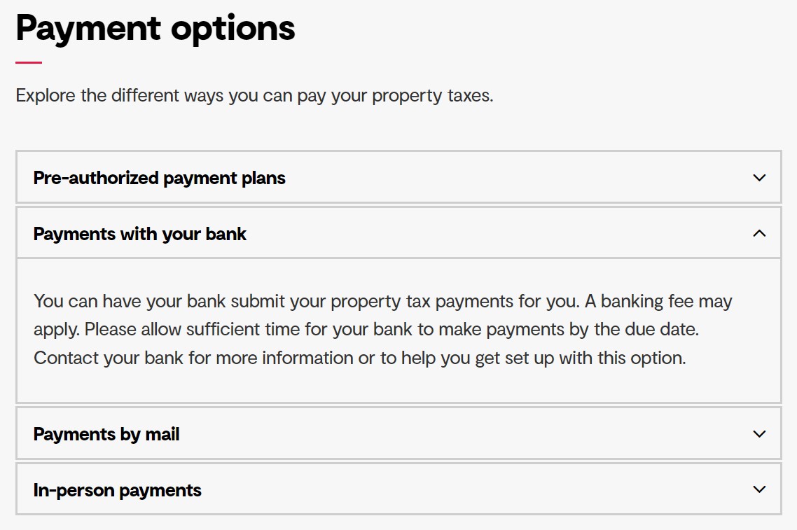
Basic

The basic accordion style has each accordion heading and its associated foldout content contained in an outlined box with sharp corners.
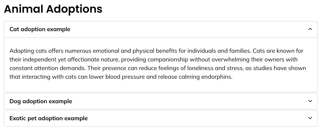
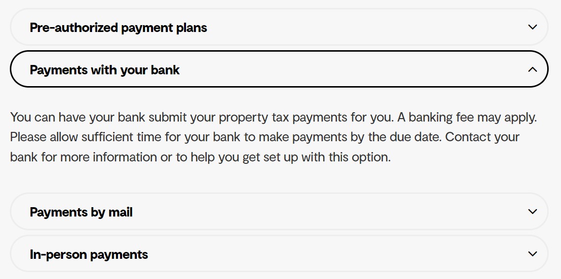
Example of basic accordion style

Button

The button accordion style has each accordion heading in its own outlined box with rounded corners, with its associated foldout content appearing below without a box outline.
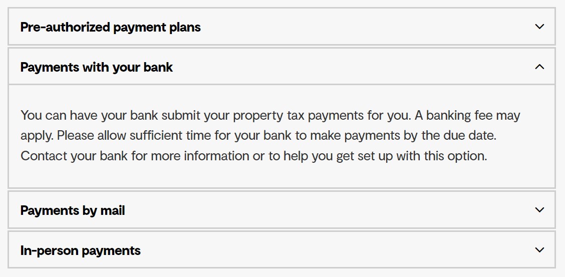
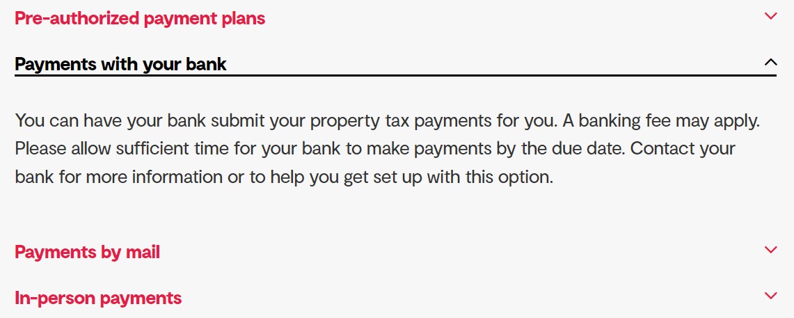
Example of button accordion style

Underline

The underline accordion style underlines an accordion heading when you open the foldout content below it.
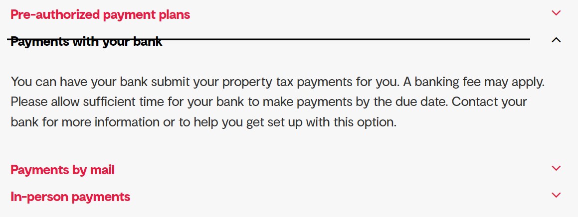
Example of underline accordion style

Line through

The line through accordion style strikes through an accordion heading when you open the foldout content below it.

example of line through accordion style

You can adjust the initial open state of your accordion foldout with the "Open options" section in the component settings. You can choose between closed, first open, last open, and open.

Closed

All accordions in the component will be closed when the page loads.

First open

The first accordion in the component will be open when the page loads.

Last open

The last accordion in the component will be open when the page loads.

Open

All accordions in the component will be open when the page loads.

Component

You can customize the content colours of the component using the colours that are part of your website design. Depending on your website design, you can add a coloured background behind the component to create a hot spot on the page. 

Colour options

The colour options are based on the design of your website. You may be able to change the design colours depending on your Govstack plan. To get access to the website design features, speak with your GHD Digital Account Executive.

If you'd like, you can add an image to the background of your component. To do this, you need to:

  1. Select the "+" icon next to the "Background image" field
  2. This will open the 'Media' folder
  3. From here, choose the folder that contains the image you'd like to add
  4. Select the image you'd like to insert
  5. Press the "Select" button 

Please note

Background images ignore the focal point and cropping information added to your image in the media tab. Instead they use the settings provided under "Background image options".

Adding an image behind text can cause colour contrast issues for users with low vision or colour blindness. You should only add an image behind text if it meets the colour contrast ratio requirements associated with accessibility legislation in your region.

Background images do not use alternative text and are not called out for those using screen readers. Make sure that background images do not contain information critical to understanding the meaning or context of your content.

You can also set a few options for a background image, including the placement of the image, size of the image and whether or not the image repeats. 

Image Size

These settings replace the cropping and sizing settings added in the media section image editor.

Cover - The image will stretch to fill the available space. This is the most popular option for a single image background.

Full-Width - The image stretches to fill the full width of the available space. Depending on the characteristics of the image this may result in gaps at the top and bottom of the component.

Auto - The image displays at it's actual size. This may leave gaps around the edges of your component.

Repeat - The background image with tile vertically and horizontally. Use a smaller image or a tiling image for best results.

Repeat Horizontal - As repeat but the background image tiles in a single row.

Repeat Vertical - As repeat but the background image tiles in a single column.

Image Placement

This setting replaces the focal point setting added in the media section image editor.

Select the origin point of your background image. The image will fill the space behind your component starting from the selected point. You may need to experiment to find the best contrast and focal point position for each image.

This setting only applies if you are using a page with a 'Full' page layout. Typically, full page layouts are reserved for the home page of your website or any landing pages you've created.

Animation

You can add animation to the component by selecting the 'Animate' toggle. Once the 'Animate' toggle is selected, you'll have the option to customize the:

  • Animation style
  • Animation delay (seconds)
  • Animation duration (seconds)

From the 'Animation style' dropdown menu, select the type of animation you'd like to add to the accordion. There are a variety of different animation options in the following categories:

  • Attention Seekers
  • Bouncing Entrances
  • Fading Entrances
  • Flippers
  • Light Speed
  • Rotating Entrances
  • Sliding Entrances
  • Zoom Entrances
  • Specials

We recommend testing out a variety of animation styles to select the one you like the most. 

Please note

Animation styles can cause accessibility issues for some users visiting your website. For example, some users may experience motion sickness when viewing animated elements on your website.

Using the 'Animation delay' slider select the time in seconds that you'd like to delay the animation. 

Please note

Animation delay can cause accessibility issues for some users visiting your website. Certain animation styles and delays can combine to make your animated component invisible to screen readers. Please test your animations to make sure they are accessible.

You can select how long you'd like the animation to last on the component by using the 'Animation duration' slider. Select the number of seconds you'd like the animation to continue on the public website. 

Advanced

In the 'Name' field you can give a unique name to the component. This will make it easier to differentiate between components, both on your page as well as in your clipboard.

You can create an anchor link that will link a user directly to the top of this component. 

When linking to this page add the anchor to the "Anchor / querystring" field in the "Select link" dialogue box. The link will then jump to the top of the target component rather than to the top of the page.

Note that anchor names are case sensitive. For best results use lowercase characters, numbers, and dashes only. Avoid spaces and special characters.

In the 'Custom classes' field, you can add any custom CSS classes you may have. Custom CSS classes can be found in the Design node under the 'CSS' tab in the backend of Govstack. 

If you'd like to add more than one custom class, you'll need to leave a space between each class. 

Please note

Depending on your Govstack plan, you may not be able to access the Design node in the backend. If you'd like to be able to add custom CSS and get access to the website design, contact your GHD Digital Account Executive.

We cannot guarantee that future updates to Govstack will not break or negatively impact custom CSS.

You can select additional styles to the component, including:

  • Spacing
  • Visibility
  • Design

Spacing

You can remove the spacing around the component by selecting one of the following options:

  • Remove spacing
  • Remove spacing top only
  • Remove spacing bottom only

Visibility

You can customize the visibility of the component. Select one of the following options:

  • Hide on all screens
  • Hide on extra small screens
  • Hide on small screens
  • Hide on medium screens
  • Hide on large screens
  • Hide on extra large screens

Design

Select one of the following options if you'd like to customize the design of the component:

  • Show shadows - this will add a shadow effect to the component. Note that by default most Govstack websites do not have shadows. You can add these in the Design node
  • Sticky - the component will stay on the screen even as users scroll down the page

Turn on the 'Hide from website' toggle if you'd like to hide this component from the web page.

When to use an accordion

Accordion foldouts can help if your word count or reading grade level is getting high. If you've set up your page using the inverted pyramid,  you can place important details and next steps inside accordion foldouts, but make sure to avoid hiding any “need to know” information.

Accordions also work well if you're presenting a few options to the visitor of your page (e.g., different payment methods) and they have to make a decision.

Creating a link to an anchored accordion 

To begin, determine the anchor name for the targeted accordion. Use one of these options:

  • If the page with the target accordion has been published, you can click the accordion on the live website. The target anchor will automatically be added to the page URL in the browser address bar. Copy the section of the link following the '#'.
  • If the page has not been published, you can determine the anchor by removing all the spaces from the accordion's heading. For example if the accordion's title is "Example Accordion 1" the anchor would be #ExampleAccordion1.

To navigate to and open an anchored accordion:

  1. Create a link to the target page using a button or the "Insert/edit link" tool
  2. In the Select link dialogue enter the anchor name in the "Anchor / querystring" field
  3. Click "Create" or "Submit"

Please note

You can only open accordion foldouts when navigating from another page in your website. If you attempt to link to accordions on the same page the view will jump to the targeted accordion, but the accordion will not open.

Preview and publish changes

Once you've added an accordion to your page, make sure to preview and publish the page to complete the process.

Contact Us

GHD Digital Support
Primary +1-866-691-5528
Secondary +1-519-884-2476
Submit Online