Skip to main content Skip to footer


Learning Centre

Converting Grids to other Components

The Grid Layout component is no longer supported in the Govstack CMS. You may still see it as an option in your components list marked as the Manual Editor, but content functions are no longer available.

Here, we've provided some suggestions on how you can convert content that uses the grid layout into more current components in the Govstack CMS.

Row options in the Grid Component

When initially creating a grid layout there are a number of row options available. The column divisions for a row, help determine which other components may be most suitable to replace the content. 

Unfortunately, if you are using some of the more exotic configurations, you may need to redesign your content to fit into the options available. 


Rows with equal columns

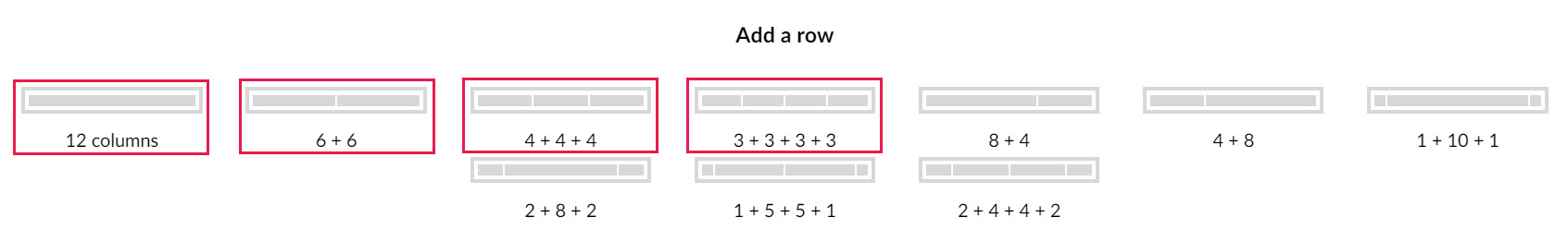
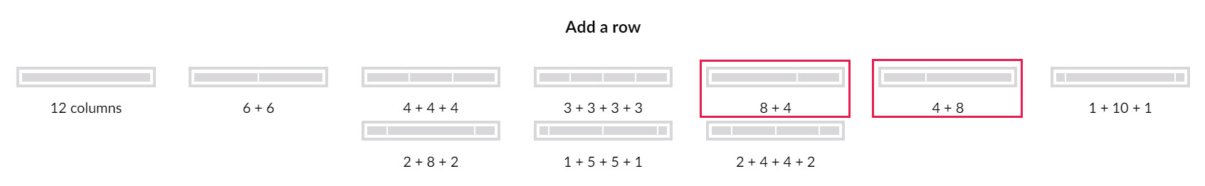
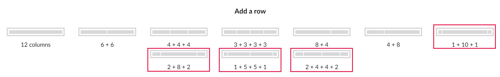
The first 4 options in the 'Add a row' tool use equally spaced columns. These can be easily replicated in your content using Pods.

Pods allow you to create content with up to 8 equal columns. However, you will need to populate your pods with additional components. The most common option is the Text/Image component. These components replicate the default 2-part layout of the original grid default content, and allow you to create various configurations of text with an image positioned above, below, to the left or right, or behind the text.

Text/Image components can also be used without images to create basic text blocks.

A wide variety of other sub-components are also available inside pods to replicate your grid layouts, including accordions, news and calendar feeds, quotes, social media icons, and imbedded media.

Rows with unequal columns

Options 5 and 6 in the 'Add a row' tool (8+4 and 4+8) use 2 unequally spaced columns. These can be replicated in your content using Split Components.

Split components create a 2-column layout that give you control over the proportions of the columns. Like Pods, split components offer a wide variety of other sub-components to replicate your grid layouts, including accordions, data lists, image galleries and text.

You can also combine the solutions for even and uneven columns by adding a pod to your split component, allowing each of your columns to have columns and rows of their own, each with their own component options.

Rows with complex layouts

The last 4 options in the 'Add a row' tool use multiple un-equally spaced columns. Solutions for these more complex layouts vary case by case. These solutions may also be applicable if you have created custom column configuration for your grid rows.

The '1+10+1' and the '2+8+2' options don't have easy solutions when converting. Neither pods nor split components can replicate a wide central column with narrower side columns. Instead, we suggest that you update the layout of the page completely.

 The '1+5+5+1' and the '2+4+4+2' selection may have viable alternatives. If these columns contain text or other non-image components then a redesign will be required. Consider splitting the grid's content over multiple rows to simplify the layout. However, if any of the rows contain images it may be possible to use a Split component (if the left right proportions of the table are uneven) or a pod with Text/Image components to replicate the effect.

Text/Image components can create different sizes of image with varying amounts of text. This is more easily controlled when you place a pod inside a split component, as in previous solutions. The challenge with this option is that it will be very difficult to replicate a consistent look for the content across multiple columns. To avoid frustration you may want to replace this layout with something simpler, such as multiple rows created with pods.


Contact Us

GHD Digital Support
Primary +1-866-691-5528
Secondary +1-519-884-2476
Submit Online