Learning Centre
Images
Images can help enhance the visual look and feel of your website and can be a great way to compliment your written content. Just remember that while images are great visual aids, they should never fully replace text.
Upload an image
Before you can add an image to a content page, you need to upload the image to the 'Media' area in the Govstack back office.
Image pixel sizes
The minimum recommended pixel size for images is based on the number of columns used in the page presentation. Fewer columns results in larger images, which need larger pixel counts to prevent pixelation and blurring.
In this table we present suggested widths only. Heights can be adjusted to best suite the presentation on the page. If you are unsure a good standard size for landscape-style images is a 3:2 ratio. Divide the pixel width of an image by 3, and multiply the result by 2 to get a height. For a 2700 pixel image this is a size of:
2700 / 3 = 900
900 x 2 = 1800
The suggested size equals 2700 x 1800
Suggested image pixel size by column width
Full width, banners, and 1-column row 2700px to 3200px
2-column row 1350px
3-column row 900px
4-column row 675px
5-column row 540px
6-column row 450px
7-column row 386px
8-column row 338px
Image size and ratios
In most components you can select the size and shape of images in the Design & Layout tab under settings. Below we have provided a visual example of each of the size selections and how they would crop a typical image.
These settings are provided as ratios of width to height. So a 2:1 image would be 2 units wide and 1 unit tall. In the examples below we've added grid lines that represent these units. These grids are for explanation purposes only and will not appear on the final images.
The final size of your images is determined by 3 factors.
- What shape/size did you select in the componenet (1:1 square, 2:1, 3:4, etc.)
- How many columns you have selected, if the component allows for columns
- The available width on your webpage, usually based on if you have selected Full, or Left/Right for your layout
All images will be cropped to the selected size but you can use the focal point and cropping tools in the Media section to determine what parts of the image will be displayed.
Using the 'Original' size will keep the relative dimensions of your image file. This may not be desirable as images displayed will be different sizes if their original files do not have matching dimensions.

Original
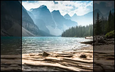
1:1 Square
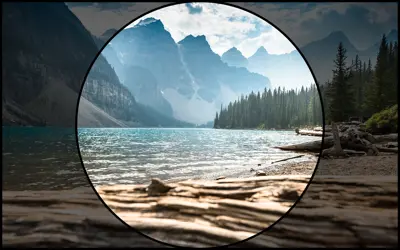
1:1 Circle
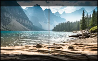
2:1
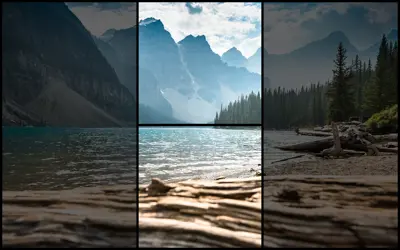
1:2
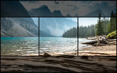
3:1
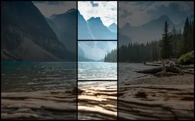
1:3
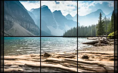
3:2
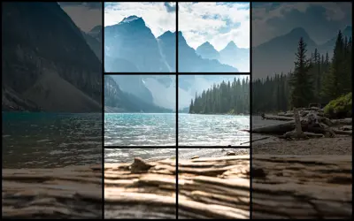
2:3
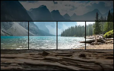
4:1
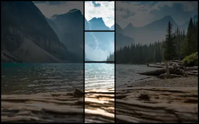
1:4
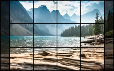
4:3
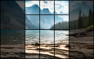
3:4
Add an image using the gallery component
The Gallery component allows you to add single or multiple images to a content page on your website. Explore the Gallery component to learn more.
Add an image in a text component
Note that adding images directly to text components is not recommended. Images added to text components will stretch to the full width of the editable area and ignore focal point, cropping, and zoom information. For better results consider using a Gallery, or using Pods with Text/Image components.
To add an image to a Text component, you need to:
- Place your cursor in the Text component where you'd like to insert the image
- Select the 'Media Picker' icon from the edit toolbar

- This will open the 'Media' folder
- From here, choose the folder that contains the image you'd like to add to the text area
- Select the image you'd like to insert
- This will open the 'Edit selected media' slide-out panel
- From here, you can add alternative text for the image in the 'alternative text (optional)' field and an image caption in the 'caption (optional)' field. Alternative text is required by the accessibility regulations in many jurisdictions.
- Choose the 'Select' button to insert the image
Before you close the text component, make sure to select the 'Submit' button to save any changes you've made.
Sizing images in a text component
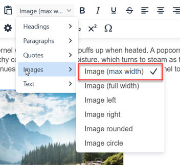
When an image is inserted into a text component it will stretch to fill the full width of the content area without consideration for the original size of the image. This can cause pixelation in smaller images and may not provide the desired control over image layout. You can use an image style to control the size of your image with more precision.
To use an image's original size or to set it to a specific size in a text componenet use these steps:
- Select the image in the text component by clicking it. Small blue handles will appear at the image corners to indicate it is selected
- If you want the image to appear at it's current size, leave it as is. If you would like it smaller you can drag any corner handle until the image is the desired size. Do not drag images larger than their original size as this will cause a reduction in quality. Images will automatically retain their proportions when dragged to prevent distortion
- With the image selected open the style pull down in the tool bar and select Images > Image (max width). This will set the image to the size in the text editing window
Delete an image from a text component
If you no longer want to display an image in a text component, you can:
- Select the image that you'd like to remove
- Press 'backspace' on your keyboard
Before you close the text component, make sure to select the 'Submit' button to save any changes you've made.
Save and publish changes
After you've added an image to a content component, make sure to save, preview and publish the page.
Contact Us
GHD Digital Support
Primary +1-866-691-5528
Secondary +1-519-884-2476
Submit Online
Need Help?


