Auto-generate links
Enable this toggle to automatically generate navigation links based on the content tree structure. If this option is enabled pages added to the website will also be added to the menu on publishing.
Alternatively, you can manually configure each menu link if you turn this option off.
Generated navigation links
Select a top-level navigation link to automatically add its subpages, organized according to their arrangement in the content tree. This option will only be available if 'Auto-generate links' is set to automatic.
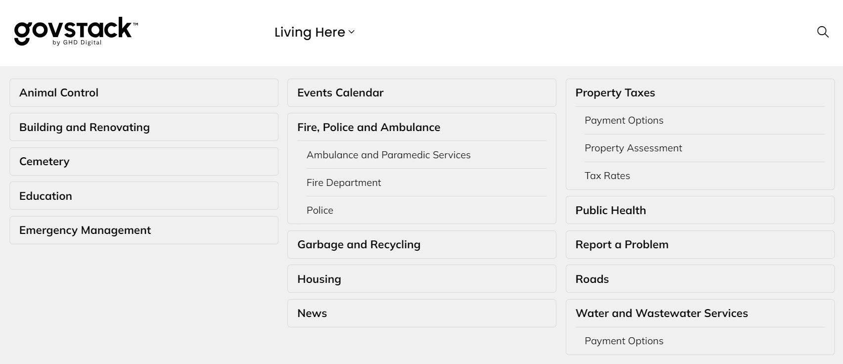
For example, your website might have a main men option called "Living Here". If you select that link, Menu Manager will add all of the subpages to the menu navigation. This helps save you lots of time when setting up your website.
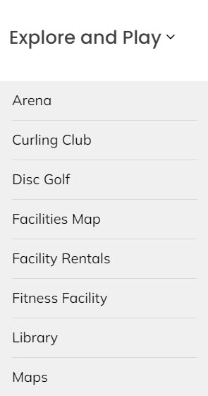
Main navigation item
This option will only be available if 'Auto-generate links' is set to manual.
Select the primary navigation link to appear as a main menu item in the site’s header. This serves as the anchor for dropdown menu items.
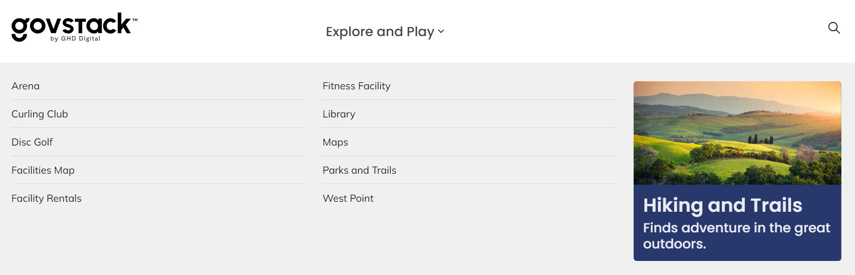
Dropdown menu items
This option will only be available if 'Auto-generate links' is set to manual.
Add, edit, or remove links that will appear in the dropdown menu under the main navigation item. Organize links to reflect the structure and hierarchy of your site’s navigation.
If child pages are added to the menu they will appear at the bottom of the list of links. The menu items can be rearranged by dragging and dropping.
If pages are added to the content after the menu is created, they will need to be included in the list manually.